#and overlay it on a teal background
Explore tagged Tumblr posts
Text

^ tensely deliberating whether or not i want to separately gradient dye every piece of fabric on this mans outfit. I think i already own denimy blue and black fabric dyes which would work for the skirt and outer cape, and i could get purple dye for the inner cape. How hard is gradient dyeing fabric tho?
Also i already own shoes that are the same shape and color as his but theyre like swirly florally burnt velvet, so not totally accurate but might add to the vibe
BTW if anyone knows of anyone whos already cosplayed eugene and wants to namedrop them, pls let me know!
#for his collar im thinking theres probably a sparkly glittery gold mesh out there#and it might work to dye that teal (blue over gold colored mesh?) to get a fabric thats tealish with gold sparkles#and overlay it on a teal background#might have some nice dimension and variation in color#also part of me genuinely considered getting his cartilage piercing LMAO but ill probably just glue some baubles on my ear#i do want to get a septum piercing but the con is in abt a month so no i do not have time to heal it and change out the jewelry#so fake septum will do#oh also i know the gradients are probs just shorthand for silky fabric or adding dimension but i love accuracy and going overboard#drawtectives
13 notes
·
View notes
Note
your rendering is so good how do you do it
Thanks, I love your rendering too!! Gonna try and make a tutorial ^^
To start off, I'm on Clip Studio Paint and these are the brushes I use! First two for rendering characters (round brushes) and the other two for mostly backgrounds (square brushes)


I used to do lineart, but it takes too long >:( now I just make a sketch and sorta clean it up!

Next I fill it in with a gray color. For simpler pieces I just put in the flat colors, but for more paint-y pieces I do grayscale -> color! I'll be doing that here :)
Also, I make 3 clipped layers on top of the gray - two are multiply, and the top one is screen. On the first multiply, I do a soft gradient using an airbrush
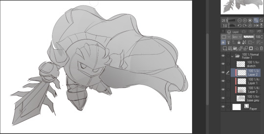
On the next multiply layer, I fill everything in with either a cool-ish or warm-ish gray, depending on the mood ^^
I also determine a light source, and use the lasso tool on the screen layer to block out where (I think) the light hits! Tbh I just do wherever feels right lmao, but I recommend having a reference! I like doing it in triangle patterns
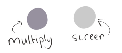
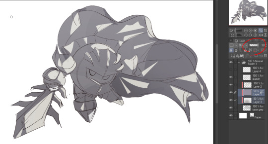
Then adjust the opacity of each layer to whatever feels right, and merge everything (I don't merge the sketch/lineart yet, I do it before adding colors in!)
Now... rendering. Some tips I have are color pick (greys) off of the canvas and use them to paint! Clean up the sketch more, erase edges, but I save details (like Galaxia's red gem, his eyes, etc.) for the end, or during coloring.
After I'm sorta happy with it, I merge the sketch layer, then duplicate it, and add a gradient map! I did this sunset-y one but changed the hue to yellow-ish, then lowered the layer's opacity ^^
Play around with the hue-saturation-luminosity setting!
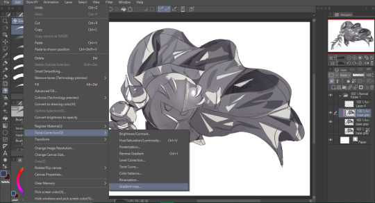
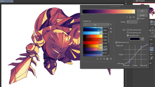

Now go crazy with blending modes! Multiply, overlay, color, glow/color dodge, etc. Feel free to layer them up on top of each other too, and this is to add the character/piece's actual colors in. For example, I used a white-blueish overlay layer for his mask and glove, blue for his cape, blah blah
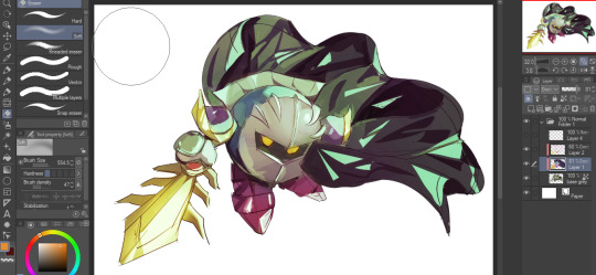
Now I clean the sketch up/refine it more. Also, to "harmonize" the color palette, you can add a colored gradient on top. Then set it to multiply, and add overlay/glow dodge layers with any colors you see fit! I like using teal and light/warm orange! Here is an example of a colored gradient:
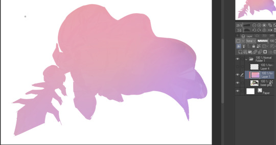
Another tip is to add saturated colors on the edges of both lighting and darker shadows, before blending it:

Also I usually add in a light blue/grey in shadowy areas, and lower the opacity for reflective light:

Also! You can lasso + use an airbush with a light blue to block out parts of the background (his cape here, for example). It helps with more depth!
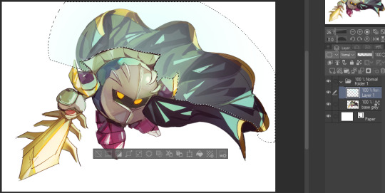
Finally, I like adding sparkles on low opacity :3 And gaussian blur to certain areas! I'm using radial blur on this piece though ^^

For the background, I like doing blocky shapes!! I use my square brush on 90% ish opacity, to color pick different hues from the piece. For lighting I use a glow dodge layer, here's a mini timelapse as well as the finished art!
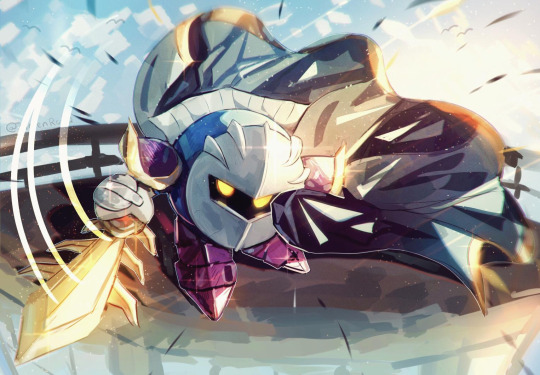
At the very end, play around with the hue/saturation and contrast tools to change the colors :)
#iiii hope this helped??#first time making a tutorial sorry!!#art tutorial#kirby meta knight#meta knight fanart#meta knight#nintendo kirby#kirby nintendo#kirby fanart#kirby series
544 notes
·
View notes
Text
Just a colour experiment 🌈
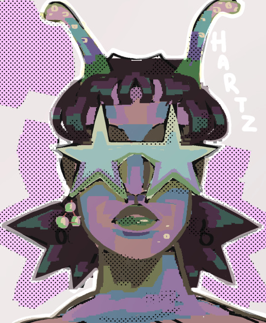
[ID: A woman, wearing star shaped sunglasses, with short baby bangs and very spiky hair below the ears. She seems to be an alien to some degree, having two antennas sticking out of the top of her head. She wears an earring on one side but not on the other, the earring is three pearls in a triangle shape. Her light skin is shaded in greens, pinks, blues and yellows. Her lips shades of greens. Her dark hair is shaded in desaturated purples, brighter purples and teals. Her sunglasses in pale yellows, blues, purples and greens. The background is a light grey, with splotches of pink around the character and halftones overlayed in places. The name, "Hartz" is next to the character. /end ID]
#art#described#described art#digital art#oc#original character#image described#original art#alien#alien art#hartz (oc)
103 notes
·
View notes
Text
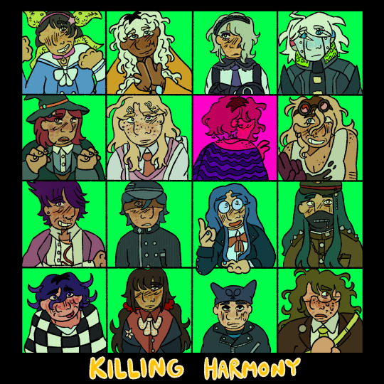
who killed rantaro amami? and a series of related mysteries.
[ID: a digital drawing of the student cast of danganronpa v3: killing harmony. all of them are arranged on a 4x4 grid. the background of the squares are all a bright neon teal, aside from rantaros square, which is bright pink with a heavy pink overlay. the rest of the background is black. towards the bottom of the image, the text reads "killing harmony" in bright yellow.]
#drv3#v3#danganronpa#danganronpa v3#killing harmony#oh boy time to tag all the characters#kaede akamatsu#rantaro amami#ryoma hoshi#kirumi tojo#tenko chabashira#angie yonaga#korekiyo shinguji#miu iruma#gonta gokuhara#kaito momota#kokichi ouma#kiibo#tsumugi shirogane#maki harukawa#himiko yumeno#shuichi saihara#joeys art#image described#this was a really big one but im so happy with how it turned out!#i have a lot of ideas for v3 art i cannot wait to finish this game#despite my issues with this game i do enjoy it! im having a good time!
150 notes
·
View notes
Photo
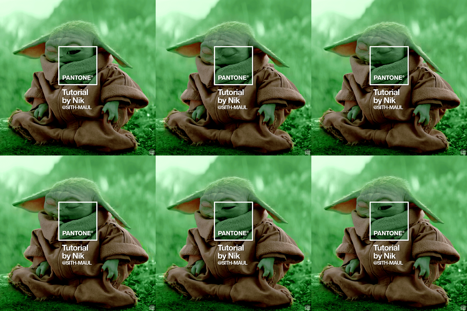
HOW TO: Make a Pantone “Color of the Year” Gif
A few people have asked about my Pantone sets which use the “Color of the Year” swatch design. So, here’s a full tutorial with a downloadable template of my exact overlay! Disclaimer: This tutorial assumes you have a basic understanding of gif-making in Photoshop.
PHASE 1: PICKING A SCENE + PANTONE COLOR(S)
I’m starting with this because it’s crucial for planning your gifset as well as making sure the execution is smooth sailing. The steps in this phase won’t necessarily be literal steps but some tips for how I usually go about making a Pantone set:
1.1 – Picking a scene. Scene selection is everything. To make things easy on yourself, I suggest choosing scenes where the background is mainly ONE color — for example, a scene where the subject has a clear blue sky behind them. To make things even easier, choose a color that isn’t the same color as the subject of your gif. Like, if your subject is a human, I’d avoid using a gif with a red or yellow background unless you want to do a lot more work to mask their skin.
Rip me using a scene of green lil Grogu in green grass lmao. But I guess that goes to show you could really do this with any scene (I just did lots of masking and keyframe animations to perfect this green shade). BUT selecting your scenes wisely = a lot less work.
1.2 – Picking Pantone colors. People often ask me how I choose my colors and there are a few methods which I’ll go over below.
But note that not all Pantone colors have a cute name, or any name (fun fact: only Pantone textiles have official names and they end with TCX, TPX, or TPG).
METHOD A: Google Search “Pantone [Color]” Source: Google Easy but not always fruitful, all you do for this method is open Google and type “Pantone [insert color here].” For example, when searching for teal colors, I searched several things including: Pantone Teal, Pantone Turquoise, Pantone Blue, Pantone Green, Pantone Blue Green, etc. Then, just sift through the Google results and click on whatever comes up from the official Pantone website! Since Pantone’s site blocks some info behind a paywall, you won’t be able to get a hex code from them. But you can just screenshot the swatch from their site, put it in Photoshop, and use the eyedropper tool to figure out the color.
METHOD B: Color-Name Site Source: https://www.color-name.com/ This handy website lets you search by colors using the upper navigation bar. Or you can just type something like "magenta" or "blue pantone" or even “frog” and see what comes up lol. Color-name can put together palettes too! I like that this site also tells you the hex code of a color, which is really helpful for getting the right code to put in my overlay. Note: Not every color on this site is a Pantone textile, so not all of these names are Pantone-official names. You can tell it’s official if, in the Pantone row of the Color Codes table on the middle of the page, it has a code that’s 2 numbers, a dash, 4 numbers, and either TCX, TPX, or TPG.
METHOD C: User-Made Pantone Colors Archive Source: https://margaret2.github.io/pantone-colors/ For my Wednesday characters as Pantone colors set, it was all about matching the color name to the character’s vibe. So, before looking at the actual colors themselves, I wanted to find the perfect color names. I stumbled upon this page. The pros = it lists pretty much all of the current official Pantone names. The cons = it’s not convenient since there’s no filtering tool. You can do Command+F and search for keywords, but that’s it. I literally scrolled through this whole page for my Wednesday set and read every single name, which... I think means... something’s wrong with me /lh /hj
METHOD D: Official Pantone Color Finder Source: https://www.pantone.com/pantone-connect This is last on my list because I don’t actually recommend it. Unless you already have access to this resource from your school or work or something, I would never pay for it and it is a paid feature only. Boooo 👎 But there is a free trial (which I’ve never used), so if you want to see what it’s about, you can definitely go for it.
PHASE 2: MAKING THE BASE GIF
Again, just some super quick tips for making a gif that, I think, looks best with this kind of set — but if you’re still learning how to gif, I do have a basic gif-making tutorial here for extra guidance!
2.1 – Uncheck “Delete Cropped Pixels” before cropping your gif. When you use the crop tool, this checkbox appears in the top toolbar. Unchecking it allows you to move the positioning of your gif later on, which is handy in this case when you want to choose which part of your gif will be underneath the Pantone swatch. You can read more about this tip in my basic gif-making tutorial (linked above; Step 1.5 – Tip B).

2.2 – Make your gif 540px width. My gifs for these sets are usually 540x540px but I think 540x500px will also look good. I think it’s more impactful though to make a big gif to show off your coloring.
PHASE 3: ADDING THE PANTONE OVERLAY
3.1 – Download my template I made this template myself, so all I ask is that you don’t claim it as your own and that you give me proper insp or template credit in your caption if you decide to use it! Get the PSD with the transparent background here!
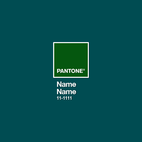
3.2 – Download the font Helvetica Neue Bold The font I use (and I’m pretty sure it’s the same font Pantone uses) is Helvetica Neue Bold, with some very specific letter spacing (which I determined by studying Pantone’s official Color of the Year Very Peri design). It’s already set in my .psd but here are specs in case: color name spacing = -40, color code spacing = -75 (sometimes I’ll do -25 for the numbers after the dash if I don’t like how tightly they’re packed together).
I uploaded Helvetica Neue Bold to my dropbox here!
3.3 – Import my overlay You can either drag the whole folder onto your gif from tab to tab or right-click the folder, select Duplicate Group, and select your gif as the destination document. Just make sure this overlay group is above your base gif!
3.4 – Fill the color swatch In my .psd, on the layer labeled “Pantone Swatch,” just grab the hex code of your chosen Pantone color and fill that layer using the Paint Bucket tool! I’ve already put a layer mask on the layer for you so it fits perfectly inside the square outline.
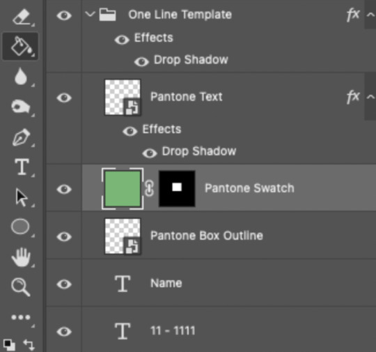
If you’re using my .psd, all the blend mode settings are already in place! I usually set the colored square behind the Pantone logo to the Color blend mode, but sometimes, I prefer the way Hue looks. It’s up to you!
You can also adjust the drop shadow settings to make your text more visible as needed. The layers are arranged in this order so the drop shadows don’t interfere with the semi-transparent part of the colored swatch.
3.5 – Insert the color name and code My .psd has two versions to choose from: (1) a color name that fits on one line and (2) a color name that requires two lines. Use the one that applies to your color name and simply type that and color code into the corresponding text layers!
Note 1: Pantone doesn’t keep their font size uniform for every color of the year. They’ll sometimes shrink the text to fit longer names, but I like being consistent. So, I use this one font size for all my colors.
Note 2: My template has all the text left-justified and matching the starting point of the P in Pantone. BUT, sometimes the gif looks better if you nudge the text a bit so it looks more centered. Use your discretion when aligning the text!
Note 3: Btw, you definitely don’t have to use the TCX/TPG codes like me. (I’m a nut and there’s no way I’ll ever do a Pantone set and not use those types of codes to maintain uniformity across this series lol.) I’ve seen others do sets inspired by mine using different color codes or even just the hex code itself!
PHASE 4: COLORING THE BASE GIF
The key here is to make a majority of your gif feature your chosen Pantone swatch. If you’re really smart with your scene selections, this should be a breeze! If you’re stubborn like me and want to use specific scenes with the opposite color of your chosen Pantone swatch, there will be a bit more color manipulation involved... However, this isn’t a coloring tutorial, so again, I’m going to give some tips and resources that will hopefully help you out!
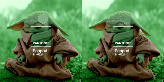
4.1 – Color matching. Now that you have the Pantone swatch on your gif, you should be able to reference that center square set to Color/Hue to match the rest of your gif to that color. Feel free to paint a little blob of your color onto another layer anywhere on your gif so you can refer to it closer over a specific part of your gif. For example, I put a little circle over Grogu’s head to see how closely I matched Pantone’s Peapod color, then I tweaked my adjustment layers a bit more until the colors matched near perfectly and I couldn’t tell where that blob begins or ends. The left is the solid color and the right is set to the blending mode Color (like the square):
4.2 – Moving the base gif. This isn’t really about coloring... but remember when I said to uncheck “Delete Cropped Pixels” in Step 2.1? Well, here’s your chance to adjust your canvas and move the gif around so the exact part you want under the color swatch is in the right position. I personally think these kinds of sets are more impactful when you put a differently colored part of your gif under the swatch so you can see through it and the difference is clearer. In my example, I put Grogu in the center so the green box would cover some of his brown potato sack robe.
4.3 – Color manipulation. Color manipulation is when you transform your media’s original color grading into a completely different color. The Grogu gif isn’t a great example because the original scene was already a green-yellow color:
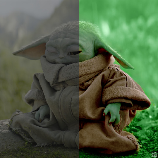
I mean, the difference is still pretty drastic but that’s mostly because my file was HDR and washed out as a result.
So, here’s an example I made using a gif from my first Pantone set for ITSV (I’m not doing this demo to the Grogu gif because it’d be too much work to manipulate a green background with a green subject. This ITSV scene is perfect bc the majority of it is blue while the subjects are mostly red.)
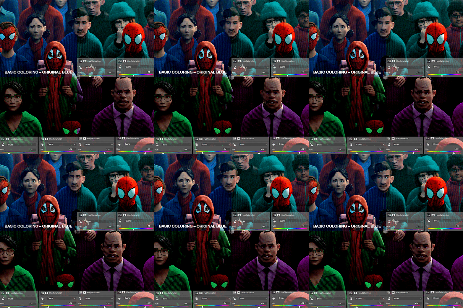
For the “basic coloring,” I did everything as I normally would: mostly levels and selective color layers.
For color manipulation, my fav adjustment layer is Hue/Saturation (those are the screenshots that are on the gif above). When you’re smart with your scene selection, it’s pretty easy to manipulate colors with one Hue/Sat layer because you usually only need to tamper with 1-2 colors and, hopefully, they shouldn’t interfere with skin tones (obviously you’ll do other layers to further enhance your gif’s brightness, contrast, etc. — but I just mean the heavy lifting usually only takes me one layer with a good scene choice).
All you have to do is figure out what color the majority of your gif is, toggle to that color’s channel, and fiddle with the hue slider. In the gif above, you can see that I played with both the Blue and Cyan channels. Here’s why:
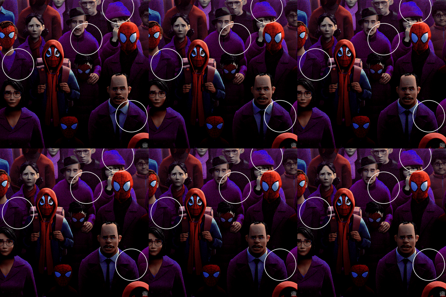
If I only adjust the Blue hue slider, I get those speckles of cyan peaking through in the gif above. Unless you’re working with completely flat colors — like 2D animation with zero shading/highlights — a color is never just one, solid color. Blue isn’t just blue, it may have some cyan. Purple isn’t just purple, I often have to toggle the Blue channel too. So, yeah, be mindful of that!
I’ll sometimes go in with the brush tool and paint over some areas of my gif to really smooth out the color and make it uniform. When I do that, I just set that painted layer to the Color blend mode. Some of the resources below go into that technique a bit more!
4.4 – Coloring resources. While not all of these tutorials cover the same type of color manipulation I did in my gifs, I think the principles are similar and would be helpful to anyone who’s a beginner: – color manipulation tutorial by usergif/me: I go a bit more in depth here (I think lol) – how to change the background of any gif by usergif/fionagallaqher: a great tutorial for using keyframes so you can manipulate the background of a gif with lots of motion – bea’s color isolation gif tutorial by nina-zcnik: this tutorial has more tips about hue/saturation layers as well as masking your subject – elio’s colouring tutorial by djarin: this tutorial shows a lot of examples of first manipulating the colors then brushing over the gif with a matching color for extra coverage
And just one last note on coloring, I always try to appreciate gifs with the mentality that “good” coloring is 100% subjective. One of the only things I would classify as “bad” coloring is when you whitewash or [color]wash someone’s skin tone. So, as long as you keep the integrity of your subjects’ natural skin — especially if they’re a POC — you should feel good about your coloring, because it’s yours and you worked hard! <3
PHASE 4: EXPORT
That’s it!! If you work in Video Timeline like me, just convert from Timeline back to Frames, export your gif, and voila!
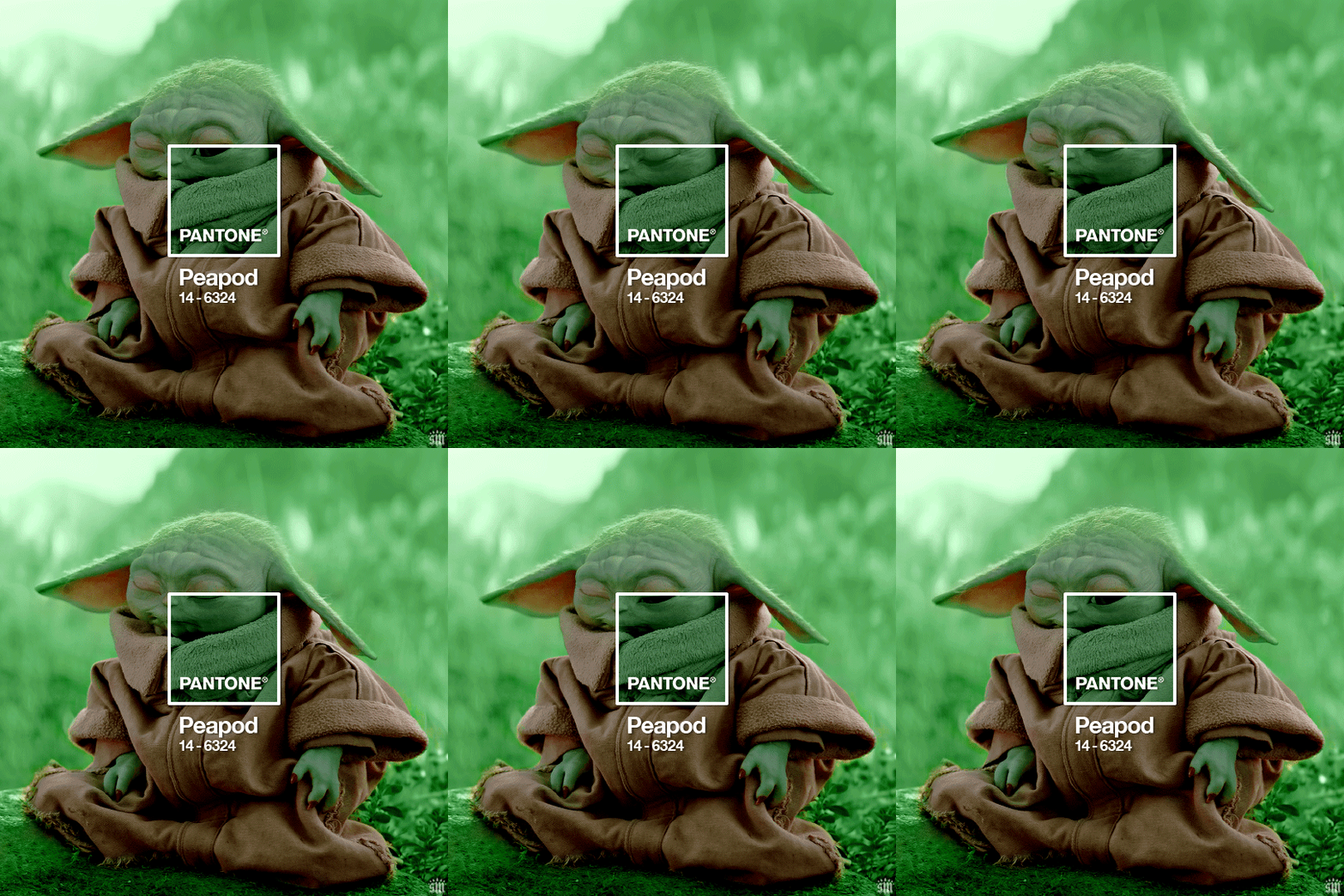
Easy PEAsy. 🥁
If you have specific questions about this tutorial, my ask box is open <3
Also, check out these other Pantone-inspired sets by my friends @nobodynocrime (Mulan set) and @wakandasforever (Ponyo set)! There are so many ways to use Pantone colors in your set, so I hope this inspires you to create something beautifully colorful <3
#gif tutorial#completeresources#usershreyu#useryoshi#userelio#userannalise#userzaynab#userives#usermarsy#usertreena#usercim#userrobin#userkosmos#usersalty#usermills#userhella#alielook#resource*#gfx*#pantone*
1K notes
·
View notes
Text
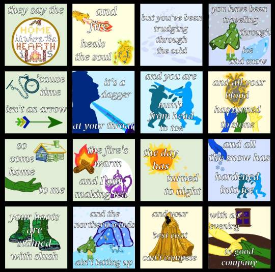
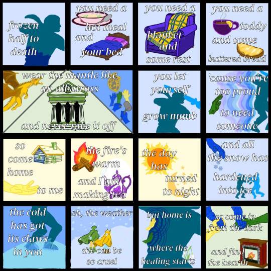
Home is Where the Hearth Is - Emily Axford (2024)
they made a pact. they broke the pact. they spent tens of thousands of years alone. and now, perhaps, they can start to be whole again.
image description under the cut:
[ID: two images that are show comic panels.
the first image is 16 comic panels showing words and drawings to correlate with the words.
from left to right, top to bottom, they are:
1: a light green background with the words "they say the" and then a gold circle with a cross stitch inside it, with the words "home is where the hearth is" stitched in, with a roof above "home" and a fireplace between the i and s of "is".
2: a light yellow panel showing a gold dragon breathing fire and a large yellow divine heart with blue and green veins with a humanoid with yellow hair, yellow skin, green pants, a brown tunic, and brown boots, (Telaine, the gold dragon) reaching out to touch it. there is a green and gold overlay to both so they appear to be glowing. the words over it say "and fire heals the soul".
3: a light blue panel with darker blue footprints moving through the panel, as though walking through snow. the words read "but you've been trudging through the cold".
4: a wintry scene with a humanoid in a green cloak with yellow pants and green, leaf-covered boots (Melora), cloak blowing in the wind. the sky is gray and the ground in front of her shows a blue patch of ice. blue snow overlays the entire scene. the words read "you have been traveling through ice and snow".
5: a light green panel showing a teal pocket watch and a green arrow with green, yellow, and blue feathers. the words read "'cause time isn't an arrow".
6: a light blue panel with a dark blue man, Aryox, with his chin tilted upwards, a blue knife pointing at his throat, lifting his chin upwards. the blue knife is inscribed with runes. the words read “it’s a dagger at your throat”.
7: a light blue panel showing two figures, frozen statues, one teal (Aryox) and one a different shade of light blue (Raedak). Raedak’s arms are extended and he is holding a sword, which has intercepted Aryox’s head. Aryox’s elbows are bent and shards of ice, the same color as him, extend into Raedak. the words read “and you are numb from head to toe”.
8: a light yellow panel showing a gray divine heart with golden veins. three hands; one blue, one green, and one yellow, extend toward the heart, as though to take it. the words read “and all your blood has turned to stone”.
9: a light green panel showing a log cabin with one side blue, one side green, a yellow roof with a green chimney, and a green window and door. below it is a green hand reaching out to the right as though to take another hand that is not there. the words read “so come home to me”.
10: a light green panel with a small fire on two logs and a purple and white tea pot with leaves as part of its design and steam coming out of the spout. the words read “the fire’s warm and I am making tea”.
11: a light green panel showing an image of the sun with an orange center and yellow rays surrounding it and a cream yellow crescent moon below it, surrounded by stars. the words read “the day has turned to night”.
12: a light blue panel showing a blue hand turned downward and blueish gray snowflakes extending down from the hand. below it is a smaller image of the frozen statues from panel 7, one teal (Aryox) and one a different shade of light blue (Raedak). Raedak’s arms are extended and he is holding a sword, which has intercepted Aryox’s head. Aryox’s elbows are bent and shards of ice, the same color as him, extend into Raedak. the words read “and all the snow has hardened into ice”.
13: a light green panel with an image of a pair of green boots with leaves drawn into them that have green laces, the boots Melora is wearing in panel 4. the toes and bottoms of the boots are speckled with light blue water stains. the words read “your boots are stained with slush”.
14: an outdoor scene with Melora, clad in her green cloak and green boots which are blowing in the wind approaching a light blue cave with a different blue interior. in front of the mouth of the cave is a light blue arctic fox, Lumi, who is glowing with a blue aura. the wall of the cave immediately inside of it is carved with an image of a gray divine heart with golden veins. three hands; one blue, one green, and one yellow, extend toward the heart, as though to take it, from panel 8. the sky is a grayish blue and snow overlays the entire image. the words read “and the northern winds ain’t letting up”.
15: a light yellow panel showing an image of an intricate gold cloak with a hood and many shades of yellow to create shadows and an intricate pattern. the words read “and your best coat can’t compete”.
16: a light green panel with a wooden window showing a purple night sky with the cream yellow crescent moon and stars from panel 11. in the foreground is a dark wooden table with two pairs of arms and hands on it, one pair is yellow and the other pair is green. the arms are resting on the table and the people are holding hands. the words read “with an evening in good company”.
the second image is 15 comic panels showing words and drawings to correlate with the words.
from left to right, top to bottom, they are:
1: a light blue image showing the teal head and torso of the frozen statue of Aryox from panel 7 of the above image. halfway down the torso, the color changes to the dark blue color he is in panel 6 of the above image (when he was alive). the dark blue is giving way to the teal. the words read “frozen half to death”.
2: a light blue panel showing an image of a pink bowl of hot soup on a matching pink plate with a spoon resting on the plate. the broth in the bowl is tan and has green onions floating on its surface. there is gray steam coming out of the bowl. below it is an image of a bed with a brown wooden frame. the made is made with purple sheets and pillows under a royal blue blanket. the words read “you need a hot meal and your bed”.
3: a light blue panel showing an image of a cushioned purple armchair. draped over the chair is a flannel blanket, the majority of which is yellow but has dark blue vertical stripes and dark green horizontal stripes. there is a fringe at the edge of the blanket that is alternating with the blue, green, and yellow of the rest of the blanket. the words read “you need a blanket and some rest”.
4: a light blue panel showing an image of a small purple teacup with brown liquid inside and steam coming off the top. there is a lemon wedge on the rim of the cup. below it is an image of a piece of brown bread with a layer yellow butter covering its surface. the words read “you need a toddy and some buttered bread”.
5: a panel that is twice the size of the other panels, separated into three triangles by gray lines. the left triangle shows a gold dragon flying upwards with its mouth open with a light green background. the center and largest triangle shows a temple with dark and light green stones constructing it, and large columns at the front. the top of the temple has a craving of a wavelike swirl at the center, the symbol of the goddess Melora. the right triangle shows a gray divine heart with golden veins. three hands; one blue, one green, and one yellow, extend toward the heart, as though to take it, the image from panel 8 of the above image, on a blue background like the cave wall in panel 14 of the above image. there are a pair of blue hands in front of it, holding a chisel and mallet, carving that image into the cave wall. the words across the top of the three triangles read “wear the mantle like an albatross” and across the bottom read “and never take it off”.
6: a light blue panel showing an image of the teal torso and head the frozen statue of Aryox from panel 7 of the above image, with the light blue sword of Raedak overlaying his head, as it does in the statue. the words read “you let yourself grow numb”.
7: a light blue panel showing a green hand reaching out to the back of the frozen teal statue of Aryox from panel 7 of the above image. between the statue are layers of blue and purple energy, keeping the hand away from being able to touch the statue. the words read “‘cause you’re too proud to need someone”.
8: a light yellow panel showing a log cabin with one side blue, one side green, a yellow roof with a green chimney, and a green window and door. below it is a yellow hand reaching out to the right as though to take another hand that is not there. the words read “so come home to me”.
9: a light yellow panel with a small fire on two logs and a purple and white tea pot with leaves as part of its design and steam coming out of the spout. the words read “the fire’s warm and I am making tea”.
10: a light yellow panel showing an image of the sun with an orange center and yellow rays surrounding it and a cream yellow crescent moon below it, surrounded by stars. the words read “the day has turned to night”.
11: a light blue panel showing a blue hand turned downward and blueish gray snowflakes extending down from the hand. below it is a smaller image of the frozen statues from panel 7 of the above image, one teal (Aryox) and one a different shade of light blue (Raedak). Raedak’s arms are extended and he is holding a sword, which has intercepted Aryox’s head. Aryox’s elbows are bent and shards of ice, the same color as him, extend into Raedak. the words read “and all the snow has hardened into ice”.
12: an image showing the blue cave wall with an icy blue floor and the feet and legs teal statue of Aryox. there is an additional layer of blue ice overlaying the feet of the statue. the words read “the cold has got its claws in you”.
13: an outdoor scene of two figures walking together through the snow up a light blue hill. on the left is Melora, in her green cloak, green boots, and yellow pants, braid peeking out from the cloak which is blowing with the wind. to her right is Telaine, with a golden yellow cloak, brown boots, and light blue pants. the sky is a slightly darker blue than the ground. snow overlays the scene. the words read “oh, the weather she can be so cruel”.
14: a light blue panel showing the torso of the teal frozen statue of Aryox. on the part of his leg that is visible is a pair of snowdrops, white bell shaped flowers drooping off of green stems. at his back are two hands, a yellow one above a green one, both of which are touching him. dark blue emanates from both hands, spreading throughout the rest of him in concentric circles. the words read “but home is where the healing starts”.
15: a light yellow panel with an image of 4 arms and hands, one yellow and one green each holding the hands of the two blue arms, as though to guide them somewhere. below that is an image of a fireplace, with brick walls, a stone border, and wooden mantle and baseboards. there is a fire at the center with two logs, the same one from panel 9 of this image. the words read “so come in from the dark and find the hearth”. /end ID]
#naddpod#not another dnd podcast#ba2mia#bahumia#aryox#telaine#melora#crumb mountain#3x60: peregrine#my art
115 notes
·
View notes
Text
Tried a new, less time-consuming rendering technique :]

[Image ID: A digital drawing of human versions of Ratchet and Optimus Prime from Transformers Prime. Both of them are drawn as men in their 50s. Ratchet is drawn sitting on a metal stool with a dark red colored seat. He has one leg hanging down and the other bent, rested on the midway beam of the stool. He is drawn with pale, lightly freckled skin and teal eyes, with a lightning scar on the right temple, a diagonal scar on the right cheek and a horizontal one on the left. He's looking down at a weathered journal of some sort, and in his other hand he holds a white tea mug with the text "World's okayest grandpa" written on it in black. The teabag's tag is hanging off the side of the mug, and the steam coming from it is used as a background element for the piece. Ratchet is smiling peacefully, with his mouth slightly open as if talking. His hair is ginger with white streaks, swept back at the front but left messy at the back. He has thick, unkempt eyebrows, sideburns and a goatee. His outfit consists of white boots with red details and steel toes, white trousers with red stripes running down the sides and horizontal strips of reflective fabric on the thighs. His jacket is mostly red with white shoulders and sleeves that have red pulse lines running down. His collar is open and he has a white zip-up with a red zipper underneath. The jacket also has reflective details, along with four pockets - 2 at the breast and two near the hem. The jacket is fastened at the middle with a white ratchet-belt with a steel buckle. His gloves are white. Optimus stands diagonally behind him, leaning forward with his hands clasped behind his back. He's drawn with light brown skin and five o'clock shadow, along with a faded scars across the left side of his chin and forehead, and a fresher, blotchy scar on the right side of his face. He has very dark colored eyes with incredibly hard to see sectoral heterochromia, partially brown and partially blue. He's looking at Ratchet, smiling gently. His hair is black with gray streaks, tied in a short ponytail with a few strands hanging near his ears. His outfit consists of a black turtleneck, a red cropped jacket with a light beige fluffy collar, blue trousers with gray patches and black combat boots that reach midway up his calves. His hands have many defensive scars on them from grabbing bladed weapons. The artist's signature "Silverior968" is overlayed over the image in blue. / End ID]
#tfp#transformers prime#ratchet tfp#optimus prime tfp#optiratch#humanformers#fanart#oh and by less time consuming I mean that I managed to cut the rendering time from around 20 hours to like 6 hours!!#the whole piece too like maybe 12 hours? I didn't count#and you might ask yourself what the fuck is up with the steam from that mug?#and the simple answer is that I love love love putting in background elements that frame the faces of the characters somehow#like i will never pass up a chance to put something in the bg that gives a character a halo#however here there was no opportunity for that and it would've felt tonally divorced from what is domestic fluff of the highest degree#so comically large swirl of steam from a hot drink will do for today
70 notes
·
View notes
Text
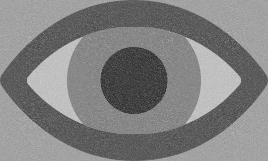
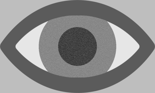
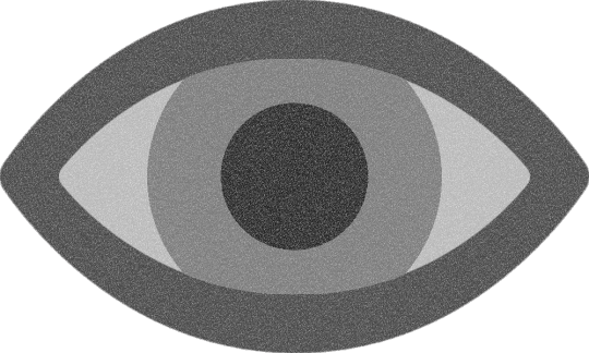
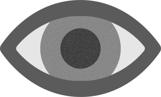
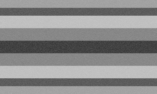


flag id: the top two flags each have a light grey background. over the background, as tall and wide as the flag itself, is an eye symbol with a dark grey outline, off-white sclera, a grey iris, and a near-black pupil. the top left flag is overlaid with static. in the top right flag, only the iris and pupil of the eye are overlaid with static.
the middle row has the eye symbols from the above two flags; these images are identical to the above images except for the lack of a light grey background. in the left image, the transparent background does not have a static overlay, but the entire symbol does.
the bottom two flags have 9 stripes, with the first, second, eighth, and ninth being smaller than the rest. the stripes are light grey, dark grey, off-white, grey, near-black, grey, off-white, dark grey, and light grey. the bottom left flag is overlaid with static. in the bottom right flag, only the fourth, fifth, and sixth stripes are overlaid with static. end id.
banner id: a 1500x150 teal banner with the words ‘please read my dni before interacting’ in large white text in the center. end id.
eye flag with full static | eye flag with partial static eye symbol with full static | eye symbol with partial static striped flag with full static | striped flag with partial static
alternate visual snow syndrome flags for @thatonefurryartist!
they suggested using dark and light greys and white with a static overlay. i decided to make some flags with an eye shape, isolate that eye shape as a potential visual snow syndrome symbol, and also provide striped flags as an alternative!
the left versions of the eye flag/symbol have static over the entire image, while the right versions only have static over the pupil and iris (since i thought it looked cool). i also made versions of the striped flag with static over the entire flag and static only over the colors taken from the iris and pupil.
tags: @radiomogai | dni link
#visual snow syndrome#vss#my flags#flag redesign#new flag#disability pride#disability pride flag#disability flag#liom flag#liom#scopophobia
30 notes
·
View notes
Text

peach pit
[ID : a chubby skywing dragon named Pyrite, who has yellowish-orange scales with a lighter yellow underbelly and dark freckles across her scales, resembling the inside of a peach. she has a crest of dark spines along the back of her neck and on the tip of her tail, antler-like horns, her body is dappled with scars, and she wears a cord around her neck like a choker. she is sitting down, facing towards the left, with her wings held open and an uncertain expression on her face. the background is a teal rectangle with white peach blossoms overlayed on top of it. END ID]
#thinking a lawttt about how pyrite was described to be the same color as a peach a lot#the freckles as described in the id are supposed to make her look like the inside of a peach#she has scars all over her body bc she was enchanted to be really clumsy so i would imagine she would be constantly getting hurt by acciden#her feet [and other skywing feet] have a fifth toe on the back kinda like raptor claws that they use for balance and grabbing things#in winter turning the original pyrite[?] was described to have black eyes so i gave her really big pupils -#- that would probably make her eyes look black head-on#she has lil bear ears btw !! i think skywings and icewings have bear ears bc theyre smaller and wont get cold as easily . also theyre cute#i just thought the crest of spines would look cute but then i realized the resemblance to icewing spikes so i added them to the tail too#the antler horns looking like icewing reindeer horns also wasnt intentional i just wanted them to look unique -#- instead of the generic straight horns or curved i usually give skywings#i think she has quite a bit of icewing remnants left over despite the spell actually#like i would imagine her fire is weaker than the other skywings and would be a lot less hotter#she also instinctively isnt used to skywing proportions hence why shes sitting the way she is with her legs all weird and wings not closed#other than that shes rather boring and isnt very flamboyant bc i think scarlet would think she doesnt deserve it#i dont really have any other design notes everything was added last second or by complete accident gafksndkxk#I JUST REALIZED THE THUMB ON HER WING IS BACKWARDS . I WAS WONDEIRN WHY IT LOOKED WEIRD CKJFMCJXNX#whatever im not fixing it. suffer with me#🖌#wings of fire skywing#wings of fire#wings of fire pyrite#og my GODDD tumblr eated the wuality on this one real bad wtfff
89 notes
·
View notes
Text
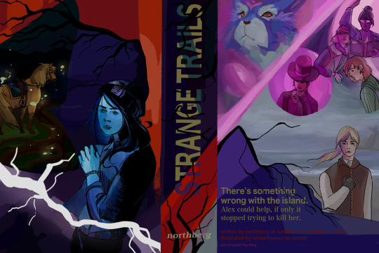
my piece for ssoblr big bang 2024! i'm very happy to share with everyone ! I worked with @northberg with their accompanying fic, strange trails, which is on ao3! please read it it's wondrous and amazing i really cannot sing enough praises for it ! i tried my best to reflect its energy as much as possible in this cover <3
alt text under cut
[ID: digital art: a faux book jacket cover of star stable online characters
on the left/the cover: tincan is standing 3/4 away from the viewer. fireflies surround him, illuminating the hollow woods behind him. some of the grass is visible and large roots are illuminated on the ground. this scene is in the shape of a moth.
above the moth shape is a spiky tree, framing the top part of the cover in red/orange. underneath the tree, the background fades from a indigo blue scene of a lake to alex, who is a teal blue and seems to be recoiling. white lightning flashes over her.
the center/spine: the title text "STRANGE TRAILS" with the font noto sans myanmar. the text is a lime green, with a streak of teal running through it, before shifting to a light purple. the background is a dark purple before transitioning to a red. black branches emerge out of the sides, obscuring some of the text/background color. at the bottom are small thin branches, growing vertically, with the author's name northberg being overlayed on top.
the right/back-cover: on the top-left is fripp and elizabeth, who is more of glowing silhouette. the background is pink and they are diagonally separated from the other characters on the right. on the top right is linda, lisa, and maya; linda and lisa are pink and look distressed, with linda casting a spell with a book in her hand, while maya is in natural colors and looks relaxed. ydris in pink is beside them; he is framed in a circle, looks mischievous, and has his hand tucked under his chin. beneath them is anne in a grey beach scene. anne has a solemn expression with her left hand over her chest. thin branches grow out to her left before transitioning to the text to the summary at the bottom of the image. the text is in lime green and the background is indigo and purple. the summary text: "There's something wrong with the island. Alex could help, if only it stopped trying to kill her." below is the credits: "written by northberg on tumblr and archiveofourown illustrated by winterlleaves on tumblr part of ssoblr big bang" /end ID]
49 notes
·
View notes
Text
happy anniversary to "Mane Mane Psychotropic" (マネマネサイコトロピック) by Kairiki Bear (かいりきベア)! this song came out 11 years ago today.

art by Shiomizu | youtube upload | august 23rd, 2024.
[Image description: A screenshot from the official music video for "Mane Mane Psychotropic". It depicts GUMI, holding her head with a worried look on her face. She's wearing a white short-sleeved button-up shirt, a yellow vest, a teal bow, and a red scruchie with stars. The background is a black and red gradient. Overlayed, at the bottom, is large text with a black and red gradient that read the japanese title of the song. End image description.]
16 notes
·
View notes
Text

It is a lovely day in Garlemald, and you are a horrible goose....
Many thanks to a wonderful friend of mine for asking me to draw her not her own Warrior of Light as a goose, but my (the purple and grey goose) and a mutual friend of ours (the black goose)'s Warriors of Light as geese, ready to attack Zenos, Untitled Goose Game style. This was an absolute delight to do, and I'm so happy I could deliver
Image ID under the cut!
[Image ID: A drawing of two geese and a man done in a lineless style inspired by that of Untitled Goose Game. The first goose is grey and purple, standing upright wearing a teal wizard hat, and holding a sword. The second goose, slightly behind the first, is black, lunging forward, and holding a wizard staff with a crescent and purple orb at one end. Both geese have an anime-style glint in their eyes indicating they’re on the offensive. The head of a man, Zenos, is partially visible in the lower left corner of the image. He has long blond hair and pale skin, though much of it is obscured by a faded blue overlay over where his eyes would be to indicate dread. While his eyes themselves are not visible, his Garlean eye (a pale, smooth protrusion in the center of his forehead) is. The background consists of a grey stone pathway in snow, with the brown roots of a tree visible in the upper right corner. There are some small tufts of pale green grass visible through the snow, particularly near the tree roots. A square, stamp style logo reading “Alex Tir Zeng” in red watermarks the image in the lower right corner. /End ID]
#ffxiv#ff14#untitled goose game#fanart#digital art#original character#my ocs#but also#not my ocs#Fandom OCs#paint tool sai#commission
10 notes
·
View notes
Text
SONA REVEAL FOR LIKE. THE LAST TIME I HOPE idk why I take this so seriously but hopefully my internet identity crisis is OVER!! 💥😃💥


Straight up. Learns a new art style just for this character bc I had to get the vibe right but she’s so ugly I love it sm. ID under the cut
[Start ID: the first image shows an unshaded colored ref sheet for an anthro Gardevoir character named Pyrite, who’s 19 and uses they/she pronouns, and asexual and genderfae flags are scribbled next to it. She is shown wearing a gray tee shirt with yellow words that say “NERD” on it, blue jorts, and black shoes with gray socks. She’s drawn in an exaggerated cartoonish style, along with a note that says “MY BLOOD IS FULL OF WESTERN 2000S CARTOONS.” She has messy hair with a long pink part in the back that goes down to her ankles, with a note indicating that she hasn’t cut it in like 8 years, and has a stray zig-zaggy hair on the top of her head. Of the white frills on her face, the largest one is an ear, and the other two aren’t. She also has a black ring on her right middle finger. Four headshots across the sheet show various expressions, along with a color palette, an example of the orange black holes that she can make, an example of her teal-colored telekinesis used on a thick Cells at Work manga, indicated on the cover as “NERD MANGA,” as well as another note that says “pretty much only likes science and fall out boy. And homework, for some reason.” Where “Fall out boy” is overlayed with the cover of Infinity on High. The background is white with pale teal stripes, and a watermark that says Fe2S: FOOLISHFOOLSGOLD is overlayed with a little 2024 written inside the F. The second image shows a few different outfits with the same background and watermark: one of Pyrite cosplaying as a red blood cell from Cells at Work, one of her in a black suit and teal tie, and one more casual outfit with black sneakers, jeans and a teal flannel over a black shirt. End ID.]
#fursona#pushing my anything can be a fursona agenda#sfw furry#my art#my ocs#described under the cut#Pokémon#pokesona#anthro pokemon#gardevoir#ralts#characer design#cells at work#hataraku saibou#lgbt+ artist#2000s cartoons
8 notes
·
View notes
Text
NEONVIRUSGLOW DTIY's Winners!!
Thank you to everyone who participated, it means so much more than I can put into words that I got 200 hundred followers in such a short time and that people like my art! :D
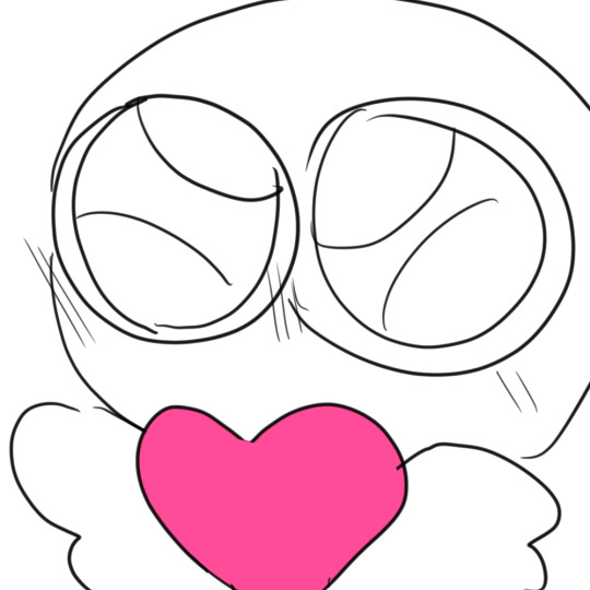
First DTIY's Winner!
@faerein29 !
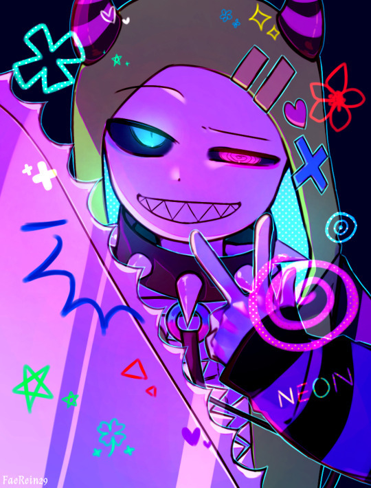
The colors for this work are amazing, and the line art and attention to detail are so cool!!! The colors pop and the details bring so much to the overall drawing I'm honestly going insane over this it takes up all the space in my brain for all 24 hours of the day. The bright lighting and the spiked color looks so great I could never put it into words. It's to be expected that Faerein would make such a beautiful drawing with all their talent and dedication! Thank you <3
Prize! (A shaded, colored, rendered art piece of multiple characters/OCs or one character/OC of your liking!)
Second DTIY's Winner!
@o4ktree !

o4ktree's cute and cartoony style mixed with the neon colors and bright spots and nice shading is driving me insane oh my god. The static overlay and dotted bright coloring brings me life! I also love how the chainsaw was drawn honestly I could never. I love the details like how the background is monotone to make the coloring pop! The expression is so cool! I could talk about this drawing for hours honestly it's just I'm really bad at writing.
Prize! (A shaded, colored, rendered art piece of one character/OC of your liking!)
Third DTIY's Winner!
@asterclaw !
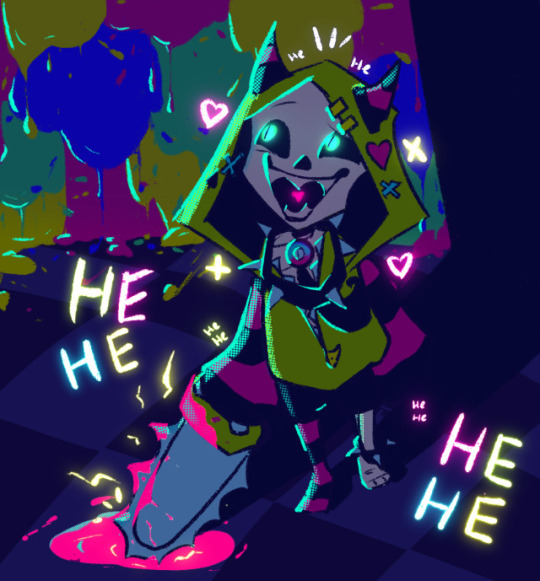
I love cartoony styles so much oh my gosh. Especially Asterclaws I absolutely adore their art style. the way the colors are dark and the shapes are so simple with such bright colors around for contrast is so cool. The bright (teal? blue? green? Hatusme Miku?) coloring for lighting just... I wanna eat it. Sorry, these are getting less formal my brain is melting from pretty art. I love the background and the paint colors dripping form the wall. I love this.
Prize! (A clean sketch that's colored with one character/OC of your liking!)
And a special thank you to all the participants, Please go look at all their works, they are about beautiful!
the-fourth-wall-6820
whittlore,
enri-ch,
capahiyosi,
miramoonli
and nexnshampoo!!!!
I adore you all and your works <3
THANK YOU!!!
For the prizes please Dm me! I'll do them as soon as possible!!!!!
#undertale au#undertale#undertale art#undertale fanart#sans#utmv#my art#myart#dtiys challenge#undertale dtiys#dtiyschallenge#dtiys neon virus#neon sans#neon virus#neon virus sans#NEONVIRUSGLOWDTIY
34 notes
·
View notes
Photo


a woman who has something deeply deeply deeply wrong with her
[id: A digital drawing of Ianthe from The Locked Tomb. She is a white woman with long blonde hair and blue eyes. Her right arm is gone, replaced with gold-covered bone. She is wearing a strapless light yellow dress, and there is a halo above her head. She is smiling smugly. She is seen from behind and to her right, tilting her head back and looking over her shoulder. She is holding an apple core in her right hand. There is a light pink overlay over the drawing. The background is a dark teal with a light cyan circle behind her. a second image is a close-up of Ianthe's face. /end id]
#the locked tomb#ianthe tridentarius#gideon the ninth#harrow the ninth#nona the ninth#tlt#ianthe tlt#fiona draws#described#gore tw#< for the arm#sorry for not posting art in almost 2 weeks finals suck so bad
109 notes
·
View notes
Text
@dandenbo asked me for the art asks: 🎠What is a typical 'workflow' for a piece from idea to finished? It turns out to be a long answer so here's its own post, under the cut to save your dash! How I go from screenshot to painting: (This is not intended to be a 'this is how you do it!' kind of guide. I absolutely don't do an optimal route, this is just how I go about painting and what works for me! I've done a workflow for a screenshot to painting as I do a few different things but this is one I could explain somewhat coherently. My comics tend to be created pretty chaotically lol)
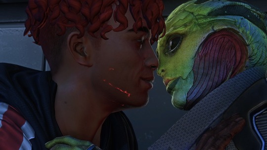
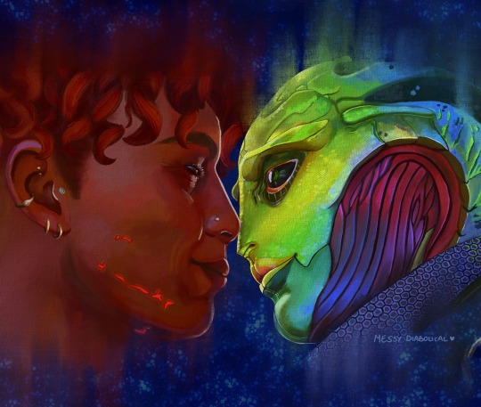
1) I take an ungodly amount of screenshots while playing. Also pester friends for their screenshots or stalk the group discord for interesting shots.
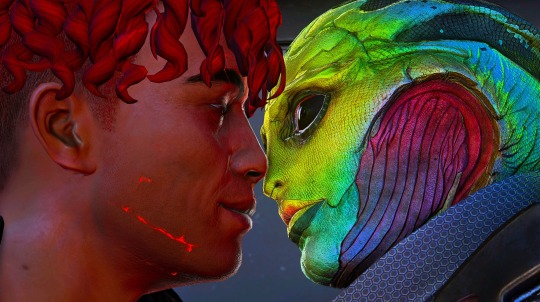
2) Go through all those screenshots cursing why I took so many, looking for those great moments that I want to paint. I’m particularly looking for nice poses/captivating moments, dynamic lighting or interesting expressions, and they don’t need to have all 3 as we can fix some of that in the next step. Here’s the screenshot I chose for my Keahi x Thane piece:

It was a cute, soft moment between them and I liked the highlight at the edge of their profiles. 3) Refine the screenshot. I don’t use anything fancy for this. I game on windows PC, so I open up the screenshot with windows photo editor. I crop the image, play around with saturation, exposure, contrast, just basic editing until it looks tastier. For this piece I wanted it to be hyper colourful and vibrant, leaning towards warmer tones.
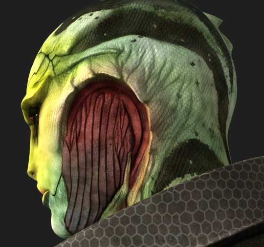
4) Decide what I will change, then gather references for those changes. In this case I was fortunate that not a lot needed changing. I knew I wanted to move Thane’s eye position to looking at Keahi rather than the way he is slightly off focus, do a more realistic ear with earrings for Keahi, make Thane a little more smiley and lower his eyelid and give Keahi nicer eyelashes. I keep a whole bunch of art guides and tutorials on my PC so I grabbed the necessary ones and sent them to my ipad ready to have on hand for the sketch stage. I have Thane’s character model in XNApose, so I can check things like his eyelid specifically in that (this is actually for a different project but shows you what I mean)
If I was going to change up the lighting/shading I would also gather references for that. For example sometimes i’ll take screenshots of lighting schemes I love from films/tv shows (think the strong teal and orange scheme in Mad Max or the neons of Blade Runner). Or for precise shadows, I can again use XNApose. I also have a little 3d printed Thane head I can shine a torch at and take photos of to get shadow ideas. For humans there’s lots of reference to be found with online searches, I find pinterest more useful than google for this. For specific expressions or body parts, i’ll just take photos of myself (hand poses, smiling from the right angle etc.) My camera roll is an interesting place. I have drawn drell frills on my neck and on my chest before to see how the lines would fold at certain angles. 5) Setting up a canvas I work in procreate. For a piece like this I try to go pretty big, say 5000 x 4000 pixels, then i’ll crop down later as needed. 300 DPI. As I work, I’ll make duplicates and continue on the copy each fresh session. When i’m finished I make a backup save of the PNG and .procreate files on an SSD. I immediately turn the background colour down to a more muted colour to not burn my retinas. If i’m using a textured background like an oil board i’ll insert it, and any overlays like canvas effects. Set up my layers from the start basically for easy toggling throughout. I try to be good and label things to make life easier, it doesn’t always happen though. I don't wear a digital glove or use paper effect screens but I do have a bottle of screen cleaner and a microfibre cloth handy at all times. 6) Sketch. I’m still very much learning to draw. I tried for a long time to do the classic ‘ball for a head, draw the planes/lines etc. It was a constant struggle and never clicked for me, the ball especially always made things much worse, turning a circle into a 3d image in my head just does not happen. I find it better to just start drawing and work things out as I go (I use procreates reference window to see my screenshot). So I’ll have my sketch in one canvas, and i’ll also have a second canvas with the photo ref on it at the same size, and if I feel like something is really wonky and off i’ll test my lines over the photo to see what’s gone wrong, then go back to the sketch and correct the areas that revealed. Sometimes I’ll use the grid feature if i’m getting stuck. Here's a few of the sketch stages:


Here I tried out the lines on the photo and noticed that Thane’s frills were a little too far to the left, and Keahi’s eyebrow needed to arch down towards the nose.In the next pass I correct these:

Also, and I know i’m gonna get side eye from some people for this but I really could not care less to be honest. On some pieces i’ll just trace the screenshot. Sometime I just want to get to painting, am not in the mood or mindspace for a learning experience, and this is a hobby. It’s my screenshot, no one is getting ripped off. My latest Javik piece was done this way 🤷♂️ 6) Painting. I’ll start by blocking in the background and the portrait flats, usually on separate layers. I try to have an idea of the background colour from the start as this can effect the whole piece overall, but sometimes you just gotta change it as you go so having it on a different layer makes this much easier.
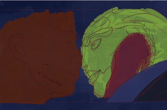
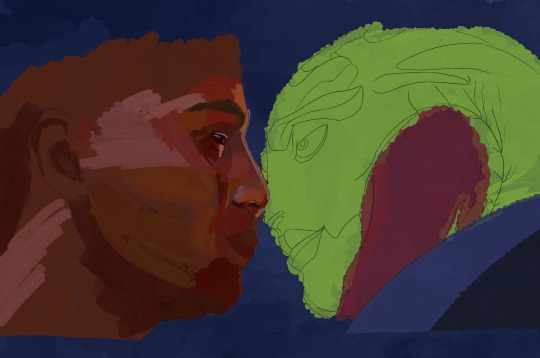
The painting itself I’ll lay down wider areas of colours, then start going in and refining bit by bit, I tend to work on one area at a time, and sometimes I’ll get pretty well rendered on a small area before moving on, other times work on a wider area. It really depends on my mood and what i’m vibing with that day. Like you can see here I’ve done some general messy colouring all over Keahi, but done a lot of refinement on the eyeball:
7) Finshing the piece, uploading and testing: When I’m sick of rendering the painting and don’t think I can add anything more to it without gnawing my own wrist off, it is time to finish up! I make sure I toggle all the layers I want on, add a top signature layer (lol I lie I forget this all the damn time). Then i’ll upload the piece to my google drive and open it up on my big 4k monitor on my PC, and on my phone, and see how it looks (my ipad is a 9.7inch air). I find that once off my ipad, it often looks a little less saturated and contrasting as it does in procreate. So I might go back and change the levels if it’s too big a difference until it looks decent across devices (it’ll never look perfect on them all though, just gotta find that happy medium).

8) Posting online I really don’t have any strict steps for this. I know some people go for optimal posting times, and will make multiple copies of their pieces in different sizes to fit better on different sites (damn you instagram and your need for everything to be square). I… do not do any of this lol. I post when I’m done whatever time or day that is. I do tend to reblog/retweet etc before I go to bed, as I live in the UK and that will at least be getting into evening time in US. I reblog my own stuff a fair bit.
16 notes
·
View notes